
Mario's Italian Restaurant — Demo
Mario’s is a demo for an upscale casual Italian Restaurant. The direction is classy and exquisite, as it attempts to bring the feeling of the Italian fine dining experience to your area. Mario’s is perfect for special occasions like celebrations, anniversaries, birthdays, and other events, but Mario’s is the place to go for any formal occasion when in the mood for some great Italian cuisine and when looking to have an enjoyable, formal night out.
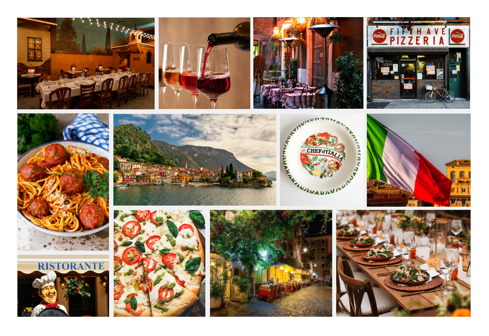
The mood board for Mario’s Italian Restaurant was created with the goal of matching the degree of passion that it takes to bring the taste of Italy to other places beyond its borders, but with an emphasis more on what makes the experience and the cuisine shine, letting the long, set tables and the cozy atmospheres speak for themselves.
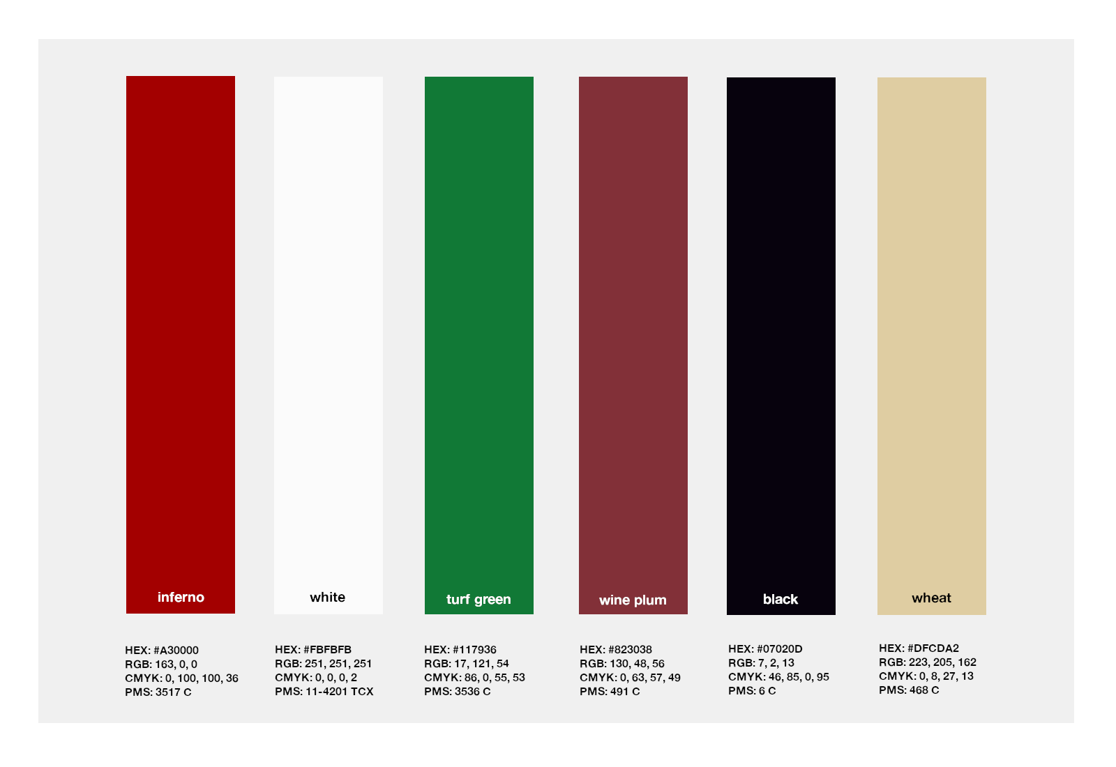
Mario’s features a color palette that draws directly from Italian culture and cuisine. The red, white, and green is taken from the Italian flag, with a darker direction for most of the colors in the palette to focus on the core evening/late night formal, adult dining experience that Mario’s offers. We added in a touch of wine plum to emphasize this as well, and the wheat shade to capture the traditional feeling of Italy.
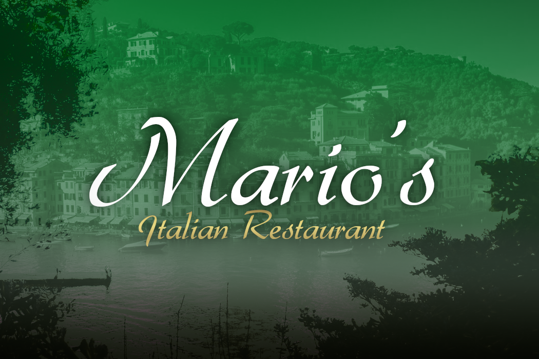
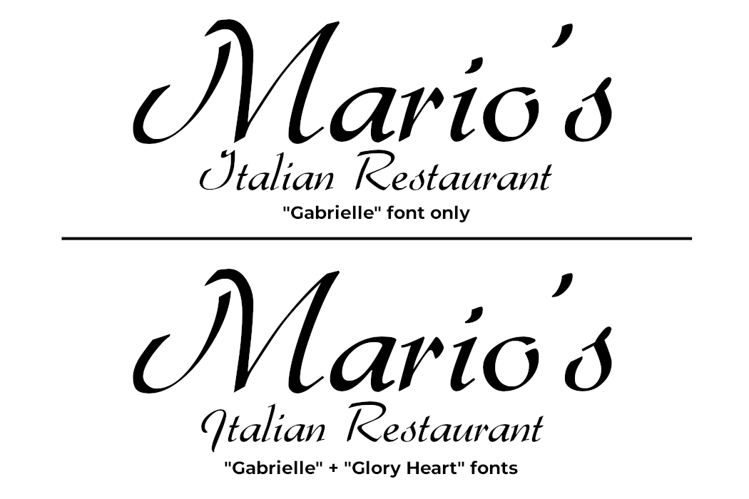
An ‘I’ for an ‘I’: Our first pass at a logo design went extremely well, however there was one small change that required addressing. With the “Gabrielle” font, the uppercase ‘I’ in Italian looked more like a ‘J’ due to the cursive script. It just didn’t feel entirely correct or look like an ‘I’, and so we combined the “Gabrielle” font with the font “Glory Heart” to make that ‘I’ look and feel more exquisite and modern. We feel this tiny, seemingly insignificant change is easy to overlook, but truly does change the design for the better in a way that aligns more with the vision for Mario’s and does it more justice.
Ultimately, we were very pleased with the logo design and its direction in terms of capturing the vision we had for Mario’s Italian Restaurant after making that slight change to the design’s font. Attention to the fine details is important to us, and we feel the final logo design perfectly matches the intention we had for crafting the Mario’s brand and is correct for the purposes of this demo.
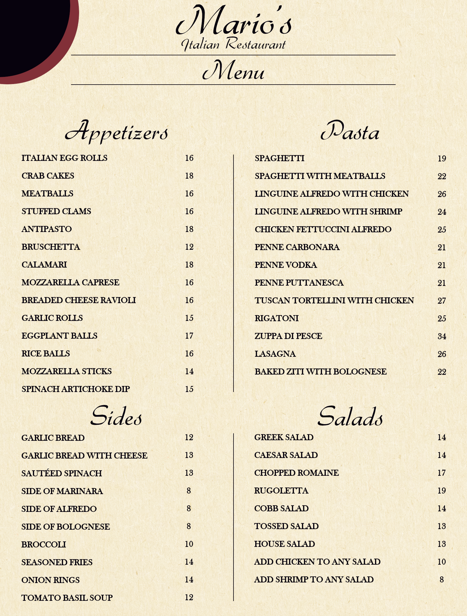
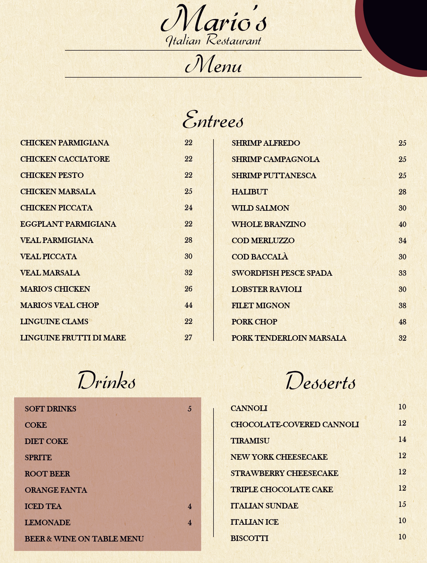
Below is a demo of a menu from Mario’s Italian Restaurant.